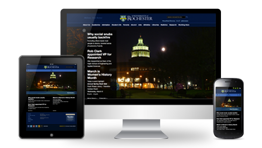
The Office of Communications and University IT have teamed up to begin converting the University website templates to a mobile-friendly design.
With the increasing popularity and variety of smartphones, tablets, and other mobile devices, the University is looking to improve the experience that website visitors have from their mobile devices. Mobile traffic to www.rochester.edu has almost doubled in just the past year, and it has increased nearly 600% over the past two years.
Rather than developing a custom mobile version of each website for each device, the team will use a responsive web design, which “responds” to site visitors based on their device’s screen resolution. The page content does not change; the page’s layout becomes flexible, automatically adjusting for optimum viewing on the visitor’s device. Some common changes on smaller screens include:
- Images scaling to fit the screen
- Horizontal navigation menus switching to drop-down menus
- Content in sidebars moving below the main page content
These changes improve the page’s readability and navigability on smaller screens.

The website that you are currently viewing has a mobile responsive design. If you are reading this from a computer, click and drag the corner of your browser window to see this page dynamically respond to the change in window size.
The first set of mobile-responsive websites—including the University homepage, most of the top-level pages, and other frequently visited websites—are being released this month. Responsive University web templates are available to website administrators by emailing Lori Packer.